9BMetrics v2
Dashboards
In 9BMetrics version 2 there are 3 types od dashboards to shpw you information. First two are running dashboards thant show instantaneious information while riding. Some of this information is sent to the AppleWatch if available.
The other is a "run in a glance" dashboard that is used to recover and show information from an historic run, we will go through eaxh one step by step.
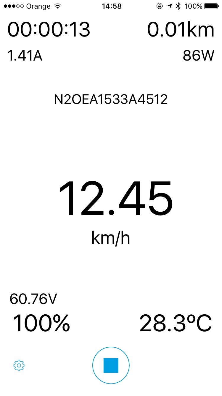
Is the more classical one. Presents all relevant information in one simple clear sheet.
The central button at the bottom is the stop recording. When the iPhone is trying to connect to the will it rotates, pushing it stops the recording and returns to the runs sheet.
The little gear at bottom left opens a settings page.
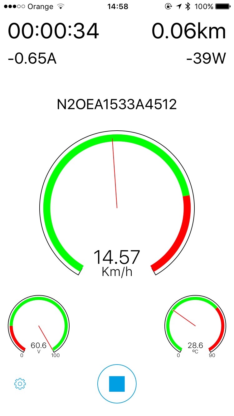
Some of the information is presented as "clocks" or "gauges". Usually green area is safe and red one may be dangerous.
Rest is exactly the same as the Classi Dashboard having the same funcionality
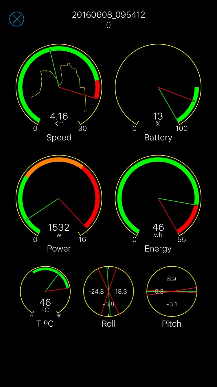
Is used to resume the information of a run once finished.
In the four five dials, green indicators are for the "mean value", red for the "maximum value" and the arcs show safe (green), no so safe (orange) and extreme (red).
Roll and pitch show the average value (green line) and max and min values (red lines). Values are also in numbers.
Finally, first dial shows a sketch of the trajectory.
Dials are active. When clicked they open the corredpondig graphic.
With 6s and in general when Touch 3D is available, force touching them open an image of the grahic. Pushing more opens the graphic.
First dial has double meaning. Clicking opens the speed graphic, long clicking the map. In touch 3D it opens the map a allows some export actions swaping up.